Hi Dojo,
In my low-code app, i have a line chart that get time-series information from two GQI queries.
Currently both lines on the chart have the same color.
Is there a way to give each line a distinct color?
Ive Herreman [SLC] [DevOps Enabler] Selected answer as best
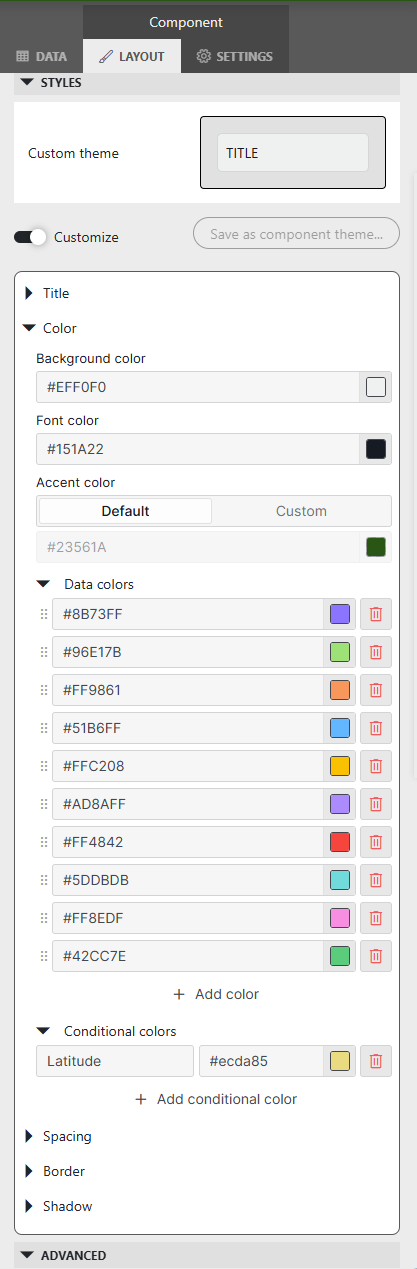
Hi Ive,
Under the layout tab of the component you can customize your theme.
By adding conditional colors, you can make a distinction between your lines (see the filter for the Latitude data to be yellow).
Hope this answers your question.
Ive Herreman [SLC] [DevOps Enabler] Selected answer as best