Skip to content
DataMiner DoJo

More results...

Generic selectors
Exact matches only
Search in title
Search in content
Post Type Selectors
Search in posts
Search in pages
Search in posts
Search in pages
Log in
Menu
  • Updates & Insights
  • Questions
  • Learning
    • E-learning Courses
    • Empower Replay: Limited Edition
    • Tutorials
    • Open Classroom Training
    • Certification
      • DataMiner Fundamentals
      • DataMiner Configurator
      • DataMiner Automation
      • Scripts & Connectors Developer: HTTP Basics
      • Scripts & Connectors Developer: SNMP Basics
      • Visual Overview – Level 1
      • Verify a certificate
    • Video Library
    • Books We Like
    • >> Go to DataMiner Docs
  • Expert Center
    • Solutions & Use Cases
      • Solutions
      • Use Case Library
    • Markets & Industries
      • Media production
      • Government & defense
      • Content distribution
      • Service providers
      • Partners
      • OSS/BSS
    • Agile
      • Agile Webspace
      • Everything Agile
        • The Agile Manifesto
        • Best Practices
        • Retro Recipes
      • Methodologies
        • The Scrum Framework
        • Kanban
        • Extreme Programming
      • Roles
        • The Product Owner
        • The Agile Coach
        • The Quality & UX Coach (QX)
    • DataMiner DevOps Professional Program
      • About the DevOps Program
      • DataMiner DevOps Support
  • Downloads
  • More
    • DataMiner Releases & Updates
    • Feature Suggestions
    • Climb the leaderboard!
    • Swag Shop
    • Contact
    • Global Feedback Survey
  • PARTNERS
    • All Partners
    • Technology Partners
    • Strategic Partner Program
    • Deal Registration
  • >> Go to dataminer.services

Dashboards – Create a visualization to display services in a critical state

Solved1.45K views16th February 2023
1
André Camões [SLC] [DevOps Advocate]571 3rd January 2023 0 Comments

For a specific use case, I need to create a dashboard that could give me a preview of all services in a critical state.

To achieve it, I tried to drag and drop the services and start to play with the associated filters. But none of them allow me to filter by state. I also tried to create a query and returned the services with the critical state.

Again, I can have visibility of all services but I can't access the state of the service.

Any suggestions to be able to implement this visualization via dashboards?

André Camões [SLC] [DevOps Advocate] Selected answer as best 16th February 2023

4 Answers

  • Active
  • Voted
  • Newest
  • Oldest
1
Koen Bouckhout [SLC] [DevOps Advocate]1.29K Posted 3rd January 2023 0 Comments

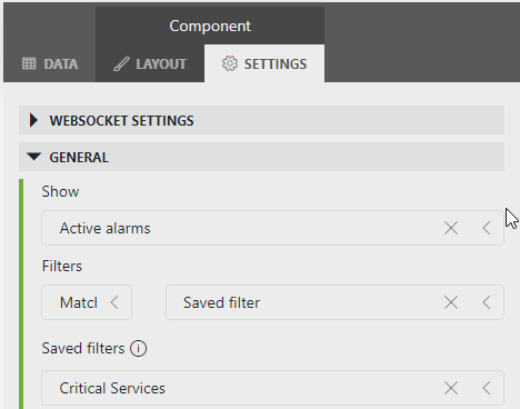
Alternatively you could use an Alarm Table component on your dashboard and linked that to a saved Alarm Filter.

As long as you can build an alarm filter that matches the critical services you want to visualize, you should be able to show them as well on a dashboard with the alarm table component. Just a thought.

Koen Bouckhout [SLC] [DevOps Advocate] Answered question 3rd January 2023
You are viewing 1 out of 4 answers, click here to view all answers.
Please login to be able to comment or post an answer.

My DevOps rank

DevOps Members get more insights on their profile page.

My user earnings

0 Dojo credits

Spend your credits in our swag shop.

0 Reputation points

Boost your reputation, climb the leaderboard.

Promo banner DataMiner DevOps Professiona Program
DataMiner Integration Studio (DIS)
Empower Katas
Privacy Policy • Terms & Conditions • Contact

© 2025 Skyline Communications. All rights reserved.

DOJO Q&A widget

Can't find what you need?

? Explore the Q&A DataMiner Docs

[ Placeholder content for popup link ] WordPress Download Manager - Best Download Management Plugin