solution Use Case
IP/MPLS network weather maps
Whether you’re a content producer, carrier, distributor, or service provider to private consumers, everyone relies on high-capacity networks to deliver services to their customers. While the migration to “all-IP” networks has streamlined the number of required network types and enabled the delivery of hundreds of Gbps per interface and tens of Tbps per fiber, it has also heightened the impact of incidents affecting these newly converged high-capacity networks. This is why modern network architectures are built with extensive redundancy and resilience. Even though networks can autonomously recover from certain fault conditions, continuous monitoring of the ‘network weather map’ remains essential for operators.
Network weather maps are vital tools for monitoring and visualizing network traffic across various routes or regions. They support several critical activities:
- Traffic load monitoring: These maps provide real-time insights into data traffic volumes across different network paths, enabling operators to identify which routes are heavily congested or underutilized.
- Capacity planning: By highlighting routes with high or low traffic, network engineers can better plan for future capacity needs, ensuring the network can handle growth and avoid bottlenecks.
- Performance optimization: Network weather maps help identify congestion points and other performance issues, allowing for traffic rerouting or resource optimization to improve overall performance and reliability.
- Fault detection: These maps can also aid in detecting faults or outages. For example, a route showing little to no traffic where it is expected may indicate a network issue that requires investigation.
- Decision-making: Network weather maps support informed decision-making regarding upgrades, maintenance, and traffic management to ensure optimal network performance.
Each of these functions is crucial for maximizing the availability and quality of services dependent on the network.
The network weather maps discussed here are associated with the IP/MPLS network supporting broadband and wholesale interconnection services for a major telco in New Zealand. DataMiner’s management scope for this account spans the entire network architecture—from the core, through aggregation and access, to the multi-service aggregation routers at business customer locations, covering more than a thousand routers in total.
The weather maps focus on the core and aggregation sections, which include approximately fifty high-capacity routers, such as Nokia 7750 and Juniper MX480 models. Visualization is powered by the DataMiner node edge component, with connections within the same site excluded and all others tied directly to the location of the respective elements. While geo-location data is used to position these nodes, users can make further adjustments to improve the visibility of edges connecting nodes that are close to each other. Conditional coloring allows the customer to freely define the number, width, and color for utilization ranges.
The displayed interface utilization figures represent the most current data in our database. Hovering over an interface brings up a tooltip with additional details and the option to access trend graphs, showing total and per-class-of-service bit rates.
Below are screenshots of the initial version of this application as it is currently used. One of the main reasons DataMiner Low-Code Apps was chosen for this use case is because it allows full customization to meet specific requirements. The customization process is actively underway, ensuring the app perfectly aligns with the project’s needs.
USE CASE DETAILS
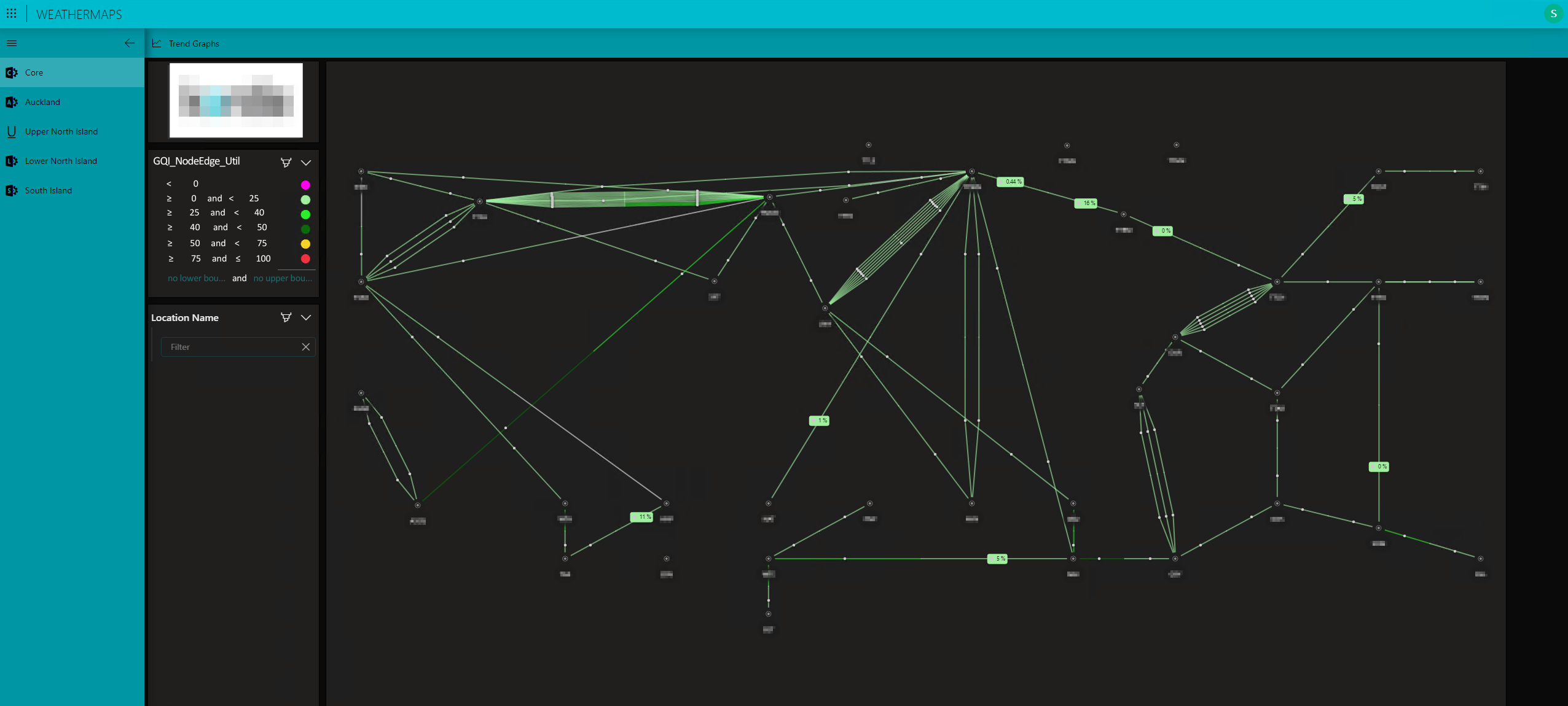
This screenshot displays the weather map for the core portion of the network, which is part of a broader visualization managed through a DataMiner low-code app. Although the weather maps cover only the core and larger aggregation sections of the network, the app provides separate tabs for the core and the various regional aggregation networks that connect to it.On the left, you can see the legend, which introduces the utilization bands and their associated colors, as well as an option to filter or zoom into a specific core location. In the top left corner, there is a button to access utilization trend graphs, along with an overview of the tabs that represent the different regional networks as distinguished by the customer.
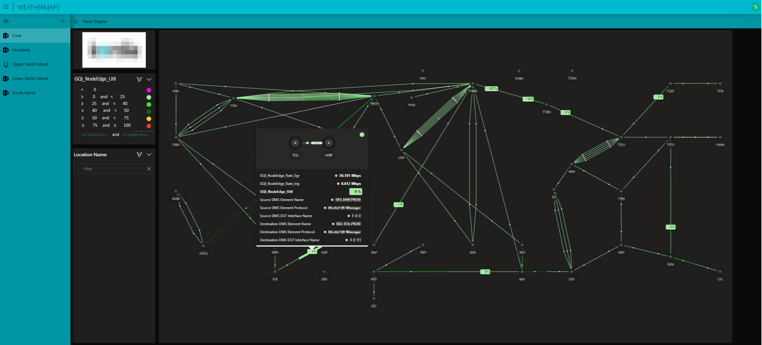 This screenshot shows the tooltip that appears when hovering over a specific interface. The tooltip can be customized to best fit your team's needs. In this instance, it provides detailed information, including the interface name, source, destination, bit rates, and the router hosting the interface. Additionally, pressing the "Trend Graphs" button in the top-left corner opens a pop-up screen displaying trend graphs for both total bit rates and per-class-of-service bit rates for the selected interface.
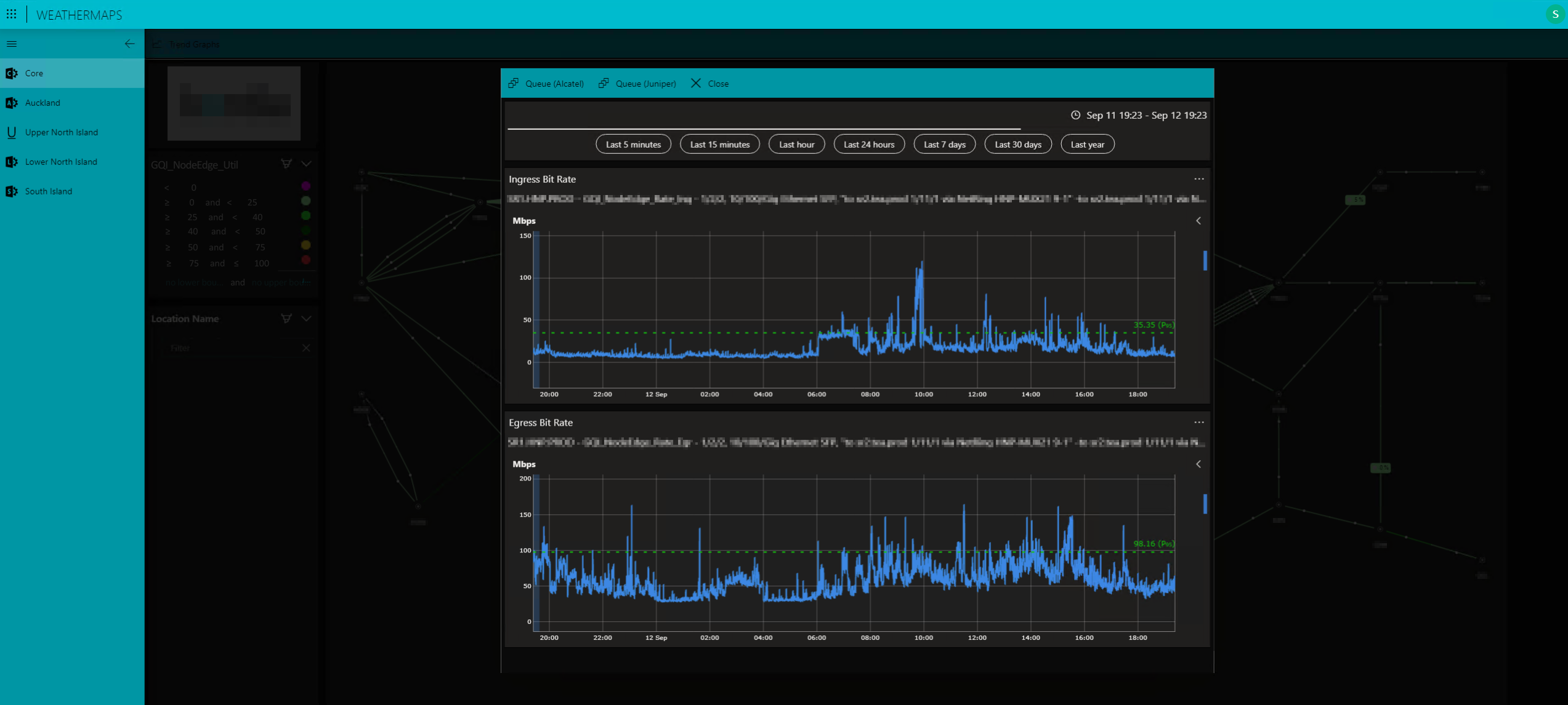 This screenshot displays the pop-up screen with utilization trend graphs. The first graph shows the evolution of the total interface bit rate, while the second provides an overview of the bit rates segmented by traffic type and class.